
 A long time ago, more years than I’d like to count, I was the assistant editor of my high school yearbook. Okay, it was 1968 and we had an art editor who was deeply influenced by the posters coming from San Francisco and Los Angeles. Snakey lettering that wrapped itself in and around obscure images of nude women or Indian warriors and announced concerts at one of the mythical concert halls of those far-off and legendary cities. The names of the bands only made the posters more exciting. Moby Grape, Jefferson Airplane, Quicksilver Messenger Service, the names looked amazing in these new-style fonts. So we adopted, and adapted the look to our yearbook. No more Letraset titles! Fletcher would ink each title page in a nifty blend of rock chic and high school trivia. “Undergrads,” “Sports,” “Special Events.” It looked awesome! Today it still stands out from the standardized “yearbook” look. Then we all got older. Rock posters took on a new, more mainstream look. The Golden Age was over, but as the children of the ’60s grew up and became successful members of society with disposable income the posters became collectible, originals (and even copies) started fetching big bucks.
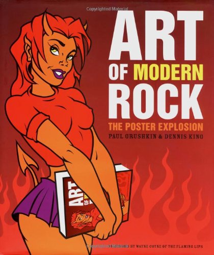
In recent years young artists influenced by those posters have started using those ’60s influences to revitalize the rock poster and to turn it back into the art form it had become so many years ago. Paul Grushkin and Dennis King had celebrated the original posters in a large and beautiful retrospective book called The Art of Rock in 1987. Now, nearly 20 years later, they have created a sequel, 13×11 in size, nearly 500 pages, full colour, beautifully designed and printed, weighing in at a whopping … okay, I don’t know how much it weighs, but it’s heavy. You’ll want to browse this one on a desk. Don’t take it to bed with you; that could be dangerous!
Subtitled “The Poster Explosion,” the book is designed to emphasize the impact of this artwork. The poster is like an explosion in its power to attract attention. And in some cases, by the damage it does. The poster hits…and what was there yesterday…isn’t there anymore. What was once a plain and functional telephone pole is now a colourful (even shocking) message of anti-social import! In his foreword Wayne Coyne (of The Flaming Lips) tells the following story:
There is an urban myth about a large, easily readable billboard located on a very busy crosstown commuter freeway. The billboard supposedly said something like, ‘SEE YOU ON THE SOUTHSIDE.’ But, because of the different dimensions of the lettering or because of the colors used, or because of some strange flaw in the billboard’s design, at a quick glance or a non-glance (which is how most billboards are perceived) the sign appeared to say, ‘SUICIDE.’ And for the six months this accidental, subliminal advertisement greeted the morning workforce, the suicide rate of the mid-thirties office employee was rumored to have increased 200 percent. If we are lucky, this is a lie. But, I fear, like all urban myths, there was an under-lying truth. In this case an under-lying horror that is unfortunately real. I hesitate even to mention it, but we are far too suggestible a species. Suggestible to a Big Mac and suggestible to a shotgun to the temple.
See, I warned you it was anti-social!
This page of text from the main Flaming Lip stands out like a sore thumb amidst page after page of neon green, fire-engine red, deep black, canary yellow, because it is simply text, black on white, a standard font. But it follows perhaps the cleverest set of introductory pages one could imagine. A poster, at least the posters that this book celebrates, is one of an edition. It is not a hand-painted unique item. It’s one of many replicates. So on the opening nine pages the book designer has presented nine posters in context. That is, each page has a different poster, except it is shown surrounded by its identical twin…nine times…simulating an edition. And the images shown in this opening selection display the range of possibilities. Warholesque photos, clip art, collage, paintings, scratchboard, and (of course) the picture of a naked woman. What would rock posters be without the picture of the naked woman? Add to this the text! Sometimes hand-drawn, sometimes borrowed from historic fonts, the text gives that essential information. The image gets your attention, and the text tells you what band is playing where, and at what time.
That is the essential purpose of these artworks. They are not essentially designed as art, but rather, their fundamental purpose is to advertise, to promote, to inform. And yet…they are art.
Grushkin and King provide some fascinating text themselves. A brief history of the silk screen process traces it back to 17th Century England and the beginnings of flocked wall-paper. A link to Roosevelt’s Works Progress Administration (with accompanying illustrations) follows the development of silk-screening into an industrial process. And a couple pages of the forerunners…rodeo ads, air shows, Warhol’s serigraphed Halston ads, and the first 60s rock posters. But the bulk of this bulky volume is page after page of the most incredible modern rock art you’ve ever laid eyes on.
You won’t have seen a lot of what’s here. These are posters made for actual events, to promote a local concert somewhere, sometime. It might be Pennywise at the Long Branch Arena on May 17th. Maybe it’s The Other Ones on August 3rd and 4th at Alpine Valley. Or even a rare solo acoustic show by Beck at the Aladdin Theatre in Portland. So, unless you’re from Long Beach, Alpine Valley or Portland, why would you have seen them?
There are 1,800 of these posters presented in The Art of Modern Rock. One thousand, eight hundred! And they are accompanied by photographs and brief biographies of many of the artists who created them. At first perusal I missed these photos altogether! It was the posters I was looking at. Page after page of beautiful, then bizarre, then disturbing, then funny, wait…funny and disturbing…images. Drawings, paintings, solarized photos, sometimes organized according to artist, sometimes by theme, the images were just so rich and plentiful that on my first time through I simply looked at them.
Next time through, I read the text which I’ve already mentioned, is informative, and extremely helpful in providing an understanding not only of the way the posters are made, but of who made them. This was when I noticed the creators’ photos. That was a nice touch. The third time through I looked for specific musicians – to see – how the White Stripes have been presented around the world, for instance. Now I’m sort of opening the book here and there to see what exciting things I might find next. There’s a chapter called “Power Tools” that describes recent developments in the use of computer software to create the images. Then there’s a chapter called “Temporary Insanity,” which displays posters that are Expressionistic. The authors describe them: “The best illustrators draw effortlessly, allowing their inner world to flow through them and onto the page. Whether the images we see are sublime and filled with transcendent beauty or disturbing and out of control, one thing is certain: many artists are compelled to express their visions honestly, no matter how disquieting.” Ummm-hmmmm! And if you’re looking for disquieting, you’ll find examples of it here!
Have I mentioned the naked girls? There are lots of them here. One has cow udders in place of her breasts, some are stunning, some are stunned. Some are amazingly lifelike, others are total cartoons. However they are portrayed, one thing is for sure: wherever they are…whatever they’re doing…it’s cold out there!
What about the aliens? Or the Hindu gods? Or the images of the Devil? Did I mention those? And for each image, there’s the text, sometimes seamlessly incorporated into the main image other times added on. But wherever it is placed it is an essential part of the overall design. The chapter entitled “No Boundaries” shows posters from other countries around the world. Canada, England, France, Israel, Switzerland, Italy, the Netherlands. Everyone is making posters and the themes and styles have no boundaries either.
I’m going to keep The Art of Modern Rock close at hand. I want to be able to dip into this well of images regularly. There are pictures I want to look at again, images I’ve missed, and there are even a few pages I might never return to…but I’m glad I got to see them. What a book, what a collection.
(Chronicle/Raincoast Books, 2004)