 The Hobbit, J.R.R. Tolkien’s original Middle Earth adventure story, was first published in paper in the U.S. when I was 10, and became a huge hit with me and my fellow Baby Boomers. I first heard the story that year, when my fourth-grade teacher read it to us; he read aloud every day after lunch. I re-read the book on my own later that year, and have revisited it many times since then.
In the winter of 2013 I overcame my reservations and went to see the first installment of the Peter Jackson film adaptation of The Hobbit: An Unexpected Journey. I was disturbed by the movie’s radical change in tone compared to the book. Jackson’s movie seemed to me to be a series of violent action set-pieces separated by boring sections of explication. This tense, loud and ominously brooding story seemed a far cry from the genial adventure tale I remembered from the book – a big-screen spinoff from a role-playing video game rather than an entertaining bedtime story. And I was a bit dismayed at the thought of a new generation growing up with this boffo box office hit as its only version of The Hobbit.
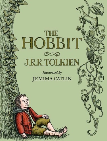
Apparently, so were the Tolkein Estate and the book’s publishers, Harper Collins in the U.K., Houghton Mifflin Harcourt in the U.S. They enlisted the young English artist Jemima Catlin to create a series of illustrations for a new edition of The Hobbit, based on work she did (for a different Tolkien story) for her art degree. You can learn more about her on her website.
My first thought on seeing this new edition was “how odd.” The illustrations are whimsical in most cases, and although they’re based on Tolkien’s own descriptions of characters and occurrences in the book, they’re also Catlin’s own unique interpretation of those descriptions. Which is as it should be.
I decided the only way to decide on whether the new illustrations work was to read the book. I’m pleased (and admittedly a bit surprised) to say that they work just fine! It was difficult to approach a book I’ve read a dozen times or more as though I were a young person reading or hearing the story for the first time, but that’s what I tried to do. And I found myself wishing that I had had this edition when I first read it 50 years ago. Due to a lack of illustrations of hobbits in that old Ballantine edition, my mental image of them more resembled shmoos than the half-sized humans they actually are, almost until that image was replaced by the Hollywood version many years later.
This is a handsome book, green cloth over board with a color-and-gilt illustration of Bilbo resting against a vine-covered tree on the cover. It’s a perfect size for reading aloud, its illustrations just right to be seen when held up by the reader or the book is sturdy enough to be passed around. Those illustrations, as befits this rather gentle adventure tale, are humorous or mildly scary as appropriate. As a bonus, you can read it in just about the same amount of time that it would take you to watch all three installments of the overblown and misguided movie adaptation.
In short, I like this new edition of The Hobbit. It’s the perfect way to introduce Tolkien’s magical Middle Earth to new generations of readers, of which I hope there are many more to come. (Please, parents, teachers: read to your children. Books.) You can learn more about it at the official Tolkien website, and I found this publishing history in the Tolkien Library helpful and interesting.
(HarperCollins [U.K.], Houghton Mifflin Harcourt [U.S.], 2013)
