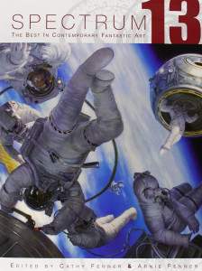
 At first glance, this year’s edition of Spectrum, the thirteenth in the series, looked a little flat. I didn’t see any of the knock-me-down standouts that grabbed me last year. Let this be an object lesson in jumping to conclusions.
First, a word about the illustrator’s job, which, simply put, is to take an idea and bring it into immediately apprehensible form. This can be an underlying editorial idea, a marketing concept, a moment from a novel, generally anything that is first expressed in words that now must be rendered into an image that might get a second’s glance and in that second has to present a complete narrative.
The most straightforward way of doing this, of course, is pure illustration: here is what the moment looks like. This seems to be the overwhelming favorite in this year’s “Book” category. Striking examples are many, including Doug Beekman’s ethereal “The Mists of Avalon” and Gregory Manchess’ sensuously rendered paintings for “The Conquering Sword of Conan,” particularly the very painterly execution of the second, an extraordinarily evocative image.
(This painterliness, by which I mean that the sensual, tactile qualities of paint handling become an integral part of the image, is highly evident in the work of Jeffrey Jones, recipient of this year’s Grand Master Award, and represents a small but distinguished strand of science fiction and fantasy illustration that owes something to Frank Frazetta and legions of muscular and highly impressionistic Tarzans — as well as a few older artists, such as Goya, Fragonard, and Courbet.)
Evocation is another facet of the best illustrations, in any genre: not only do they give you a moment, they give you a mood. They are, in fact, often more mood than moment. Particularly noteworthy in this area are the works of Dave McKean and Joshua Hagler, whose mixed media images are unsettling, sometimes outright disturbing, dense with resonance, and in the best sense of the word, evocative. I would be remiss without also mentioning Craig Mullins’ painting of a street scene in the Budayeen for George Alec Effinger’s When Gravity Fails, which became part of the best book design for science fiction for 2006, in my opinion.
Another noteworthy point, this one relating to what I have to call “the mechanics of vision.” This year I noticed a great propensity to play with scale, distance, and perspective. Under “scale,” let me cite Nate Van Dyke’s piece for Copper Mountain, which rewards a second look with the mind-bending realization of the difference between the mechanical man pouring powder on a mountain slope and the ant-like skiers ready to take advantage of his largesse. Perennially, science fiction illustrators in particular are fond of images encompassing vast distances and dizzying perspectives, but it’s a growing trend, I think: see Dan Seagrave’s “Becoming the Archetype” in Advertising, Michael Komarck’s “Principles of Fire” in Books, Brian Despain’s “Rise of the Red Star” in Unpublished, and Raymond Swanland’s “Wrecking Ball” in Institutional. These are only a few examples of a kind of image that immediately conveys the scope of the ideas being described.
And now my favorite part, and probably the hardest: personal favorites. These are the ones that I think display some uniqueness in vision and approach and a high quality of execution, and that also strike some unnameable chord in me. There are too many to list them all, but let me mention Greg Staples’ “The Death of Cu Chulainn,” a digital painting that somehow manages a painterly technique, rich chiaroscuro, and a certain albeit understated emotional punch. Among the Dimensional works, one that struck me was Nathaniel K. Lewis’ “Sages,” a series of squat, muscular male figures plugged into large all sockets, rendered darkly humorous by the location of the “plugs.” Jeremy Geddes gets included for his Gold Award-winning piece in Comics, a cover for Doomed #4, a spare, stark painting that is simply chilling. Again in Comics, Michael Knapp’s two sequences titled “Newsbreak,” an adventurous work that takes advantage of all the fluidity of design in contemporary graphic literature. And I think any cat lover who takes his cats with a grain of salt will enjoy Gris Grimly’s “Three Little Kittens” for Baby Tattoo Books. The artist Brom comes through this year with “Stickmen,” which could have been concept designs for The Nightmare Before Christmas, one of my favorite films, except that Nightmare was much less outrageous. And I must include Shaun Tan’s Unpublished “Tales From Outer Suburbia: The Water Buffalo” which struck me as quietly but hysterically funny in that “Through-the-Looking-Glass” way that is impossible to explain. (As a rule, the humor displayed in these works is mordant, often savage, and more than a little outré.) Two more artists who caught my eye, for their work in general: Cos Koniotis and Jeffrey Scott “1019,” both working in digital images with a low range of hues, either monochrome or almost so, and strong chiaroscuro that make for very effective pictures. Nor can I forget Martin French’s wildly expressionistic mixed media work of Pan, “Tummis,” a sort of “The god of Arcadia meets Jackson Pollock at 46th and Broadway.”
OK — there are too many. The rewards of looking again: there’s a fair amount of subtlety in Spectrum 13, some humor, some scariness (perhaps in some cases even scarier than last year), some poetry, and many top quality pictures. I wish I could include pictures of the ones I’ve mentioned. All I can do, though, is recommend the book.
(Underwood Books, 2006)
[Update: Spectrum is now up to its 25th volume. It us now an imprint of Flesk Publications.]
